
So it has finally happened: the second of 3 models from Chronopia range in my possession has just been painted. Must admit I got this one long, long time ago although I've never been big fan of Chronopia minis. Haven't been even small fan to be absolutely honest...
Chronopia models are definitely oldschool but apart from literally several models (Myrmadon still is supercool) I don't like them at all - no idea why. I suppose when the system was still alive I used to compare it with Warhammer Fantasy Battle and it was no match for GW stuff.
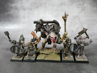
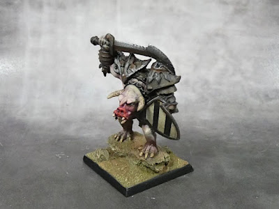
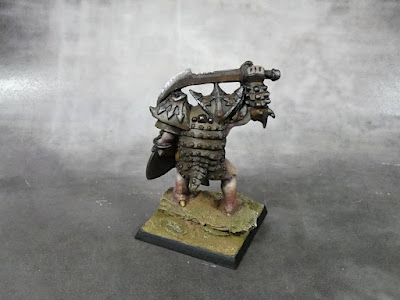
Anyway among few models I like is Dusk Real Demon and it's only because of it's cute pig face. I had no idea what to do with that model so I gave it 40 mm square base so it fits zombie / skeleton units in HOM&M Undead Army project (if I ever get it finished).
I like strong contrast between flesh and armour, but must admit the armour turned out bit too dark because once again I've overdone oils and pigments. Nevermind - it's just enough for gaming (if I ever manage to roll out my undead / demon army).
Oink! Oink! 🐷

Very nice work...they have a few cool models - I agree!
ReplyDeleteCheers mate, glad we have same view on this matter ^^
ReplyDeleteScary monster! I like the fleshtones a lot, and I think the contrast with the armour works perfectly. Nicely done!
ReplyDeleteIn case of small models solid contrast is the key to make paintjob striking 😉
DeleteAs for armour - it turned out darker then I expected because it got 2 layers of matt varnish and dry pigments in between. I added some rusty tones to make it look more "alive" but varnish consumed it all.
Not I think some jade / blue oxidation could be better choice 🤔
Niezły bebok. Gdzieś ty go wyhaczył?
ReplyDeleteHeh,
ReplyDeletekiedyś, kiedyś, jak Warzone i Chronopia przewalały się na Allegro i kosztowały normalne pieniądze dobrałem przy okazji jakichś zakupów. W Chronopię nigdy nie grałem 😉
I think the ruddy snout was a good choice to give this guy a bit of color. I don't believe the armour looks as bad as you think; it's maybe not as overtly rusty etc as you intended, but it has nice depth to it.
ReplyDeleteCheers Allison!
ReplyDeleteAsmentioned before - when it comes to painting models, contrast is the key 🙂